Accessibility in design is often treated as an afterthought—a checklist item added late in the process. But what if we flipped the script? What if accessible interfaces were beautiful by default? The truth is, inclusive design not only benefits people with disabilities but also enhances usability and aesthetics for everyone. When accessibility and beauty come together, the result is digital experiences that feel effortless, elegant, and welcoming.
At Gen Z Academy, we discovered that products designed with accessibility in mind scored 25% higher in user satisfaction surveys. Accessibility isn’t just compliance—it’s good design.
Introduction: Why accessibility matters in design
Accessibility ensures that all users, regardless of ability, can interact with digital products. This means supporting users with visual, auditory, motor, or cognitive differences. But accessibility isn’t just about compliance with WCAG guidelines—it’s about empathy. Designing for everyone creates products that are easier, faster, and more enjoyable to use, which naturally improves the overall experience.
"Design that excludes is broken by definition. True beauty is inclusive."
Principles of accessible and beautiful UI
Great design balances form and function. These principles help create UIs that are both accessible and visually pleasing:
- Contrast and clarity: High-contrast colors not only aid readability but also create striking, modern visuals.
- Scalable typography: Legible fonts at flexible sizes ensure comfort without sacrificing elegance.
- Consistent patterns: Predictable layouts help all users navigate while enhancing aesthetic harmony.
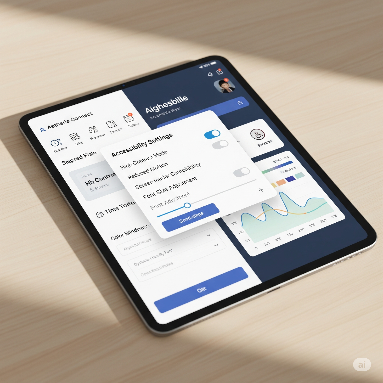
- Keyboard and screen-reader support: Invisible features that enable access while keeping the UI clean.
Accessibility does not clash with beauty—it reinforces it.
Common myths about accessible design
Some designers fear that accessibility will limit their creative freedom. In reality, constraints often fuel creativity. For example, using sufficient text contrast encourages bolder, more impactful color palettes. Similarly, designing for screen readers leads to clearer content hierarchies that improve readability for everyone. Accessibility doesn’t mean “ugly”—it means thoughtful.
Practical strategies for accessible design
To embed accessibility into your design process, try these approaches:
- Design with personas: Include users with disabilities in your scenarios.
- Test early: Run accessibility checks during wireframes, not after launch.
- Use semantic HTML: Structure content so assistive tech can interpret it naturally.
- Automate checks: Tools like Lighthouse or Axe can catch issues quickly.
Embedding these practices from the start ensures accessibility is baked in—not bolted on.
Conclusion: Beauty and accessibility go hand in hand
Accessibility is not a compromise—it’s an enhancement. By designing with inclusivity as the foundation, we create products that are both more functional and more beautiful. Accessibility by default ensures no user is left behind, and the end result is elegant interfaces that work for everyone. When we design for accessibility, we design for humanity—and that’s the truest form of beauty in digital products.